HikiMEET
A messaging app concept that helps socially withdrawn people find others who share their interests and designed to lower the social and emotional barriers to reaching out.
- Sensory-Load Reduction
- Rapid Descoping
- Behavioral Incentives
- WCAG Accessibility
Context
Problem
Prior to COVID, 2.5 million young Americans were homebound due to social withdrawal. Since then, this number has doubled; leaving vulnerable individuals facing severe isolation and high cognitive barriers to connection.
Design goal
How can I create a solution that promotes an easygoing, non-judgemental environment?
Outcome
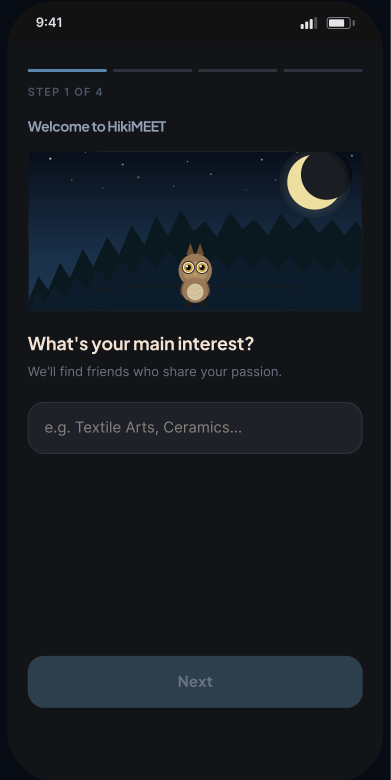
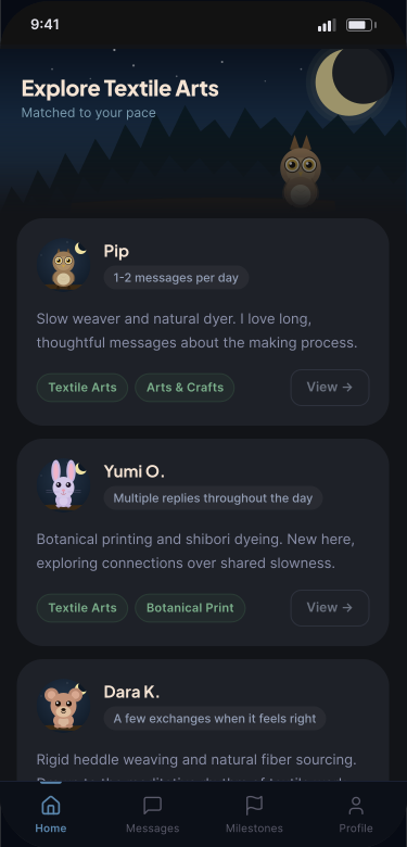
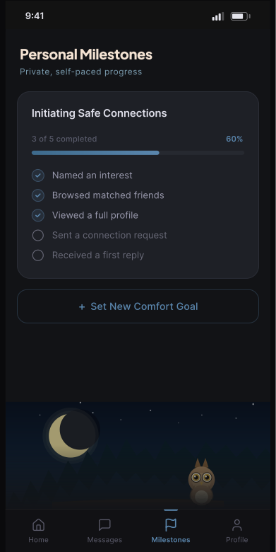
Designed a validated 4-week end-to-end concept that tackles sensory overload and long-term user retention through highly intentional, stress-free interaction loops.
Initial Research
Understanding the Reality of Social Withdrawal
8 in 10
adults in the U.S. between ages 18 to 24 reported experiencing loneliness during the COVID-19 pandemic
60%
of lonely college students wanted friends to 'reach out more to ask how you’re really doing and really listen'
40%
Cases of social withdrawal increase by 40% year-over-year in Western countries
4x
People who reported loneliness had 3x the risk of depression and 4x the risk of anxiety
Competitive Analysis
Why HikiMEET Is the Most Intentional Fit for Feel-Safe Social Discovery
 |  |  |  |  | |
|---|---|---|---|---|---|
| Welcoming Chatroom Onboarding | |||||
| Set Chatting Preferences | |||||
| No Social Media Ratings | |||||
| WCAG Accessibility |
Initial Approach / Early Hypothesis
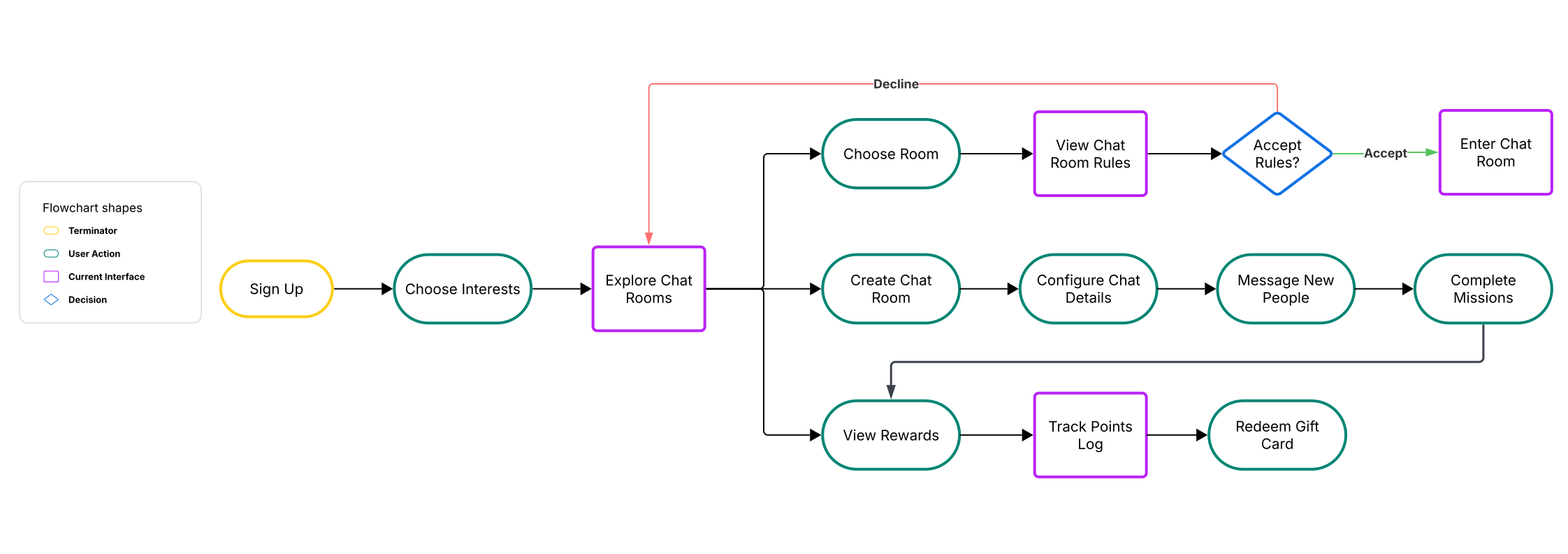
Initial app concept:
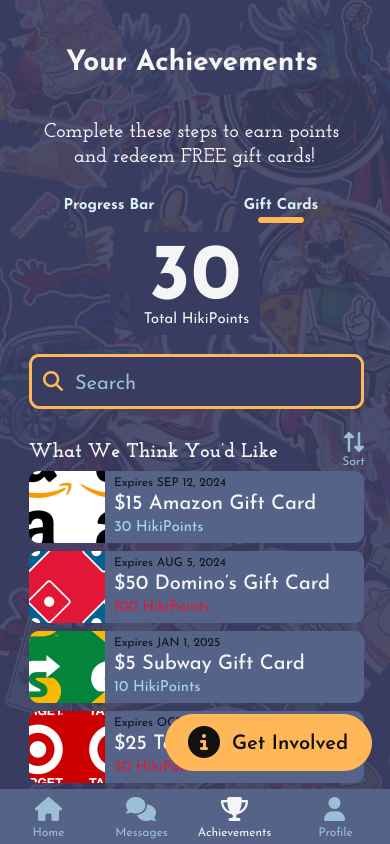
The original app was designed around a feature-heavy ecosystem that coupled public group chatrooms with a transactional, gamified rewards engine to incentivize engagement.
Original Low-Fidelity Concepts

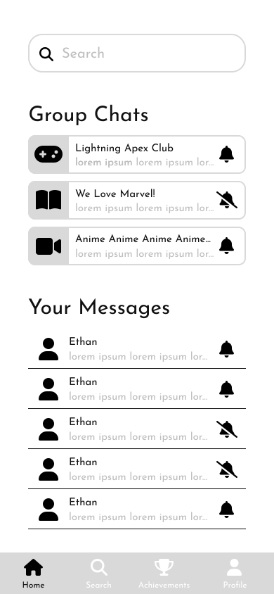
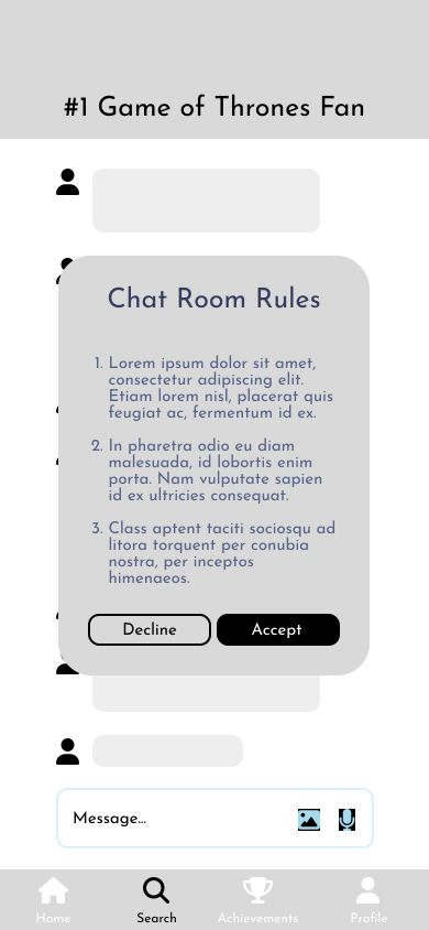
WHAT WORKED
The initial concept established a strong engagement narrative and clarified which reward-driven mechanics would need testing.
WHAT FAILED / LESSONS
The early design was too transactional and risked turning social discovery into a task, which made the experience feel overwhelming rather than welcoming.
The Critical Insight (User Testing)

WHAT WORKED
Real user feedback delivered a clear signal: the feature hypothesis was valid to test, and the results provided a decisive direction for iteration.
WHAT FAILED / LESSONS
The assumption that gamified rewards would build sustained comfort was wrong; it introduced anxiety and cognitive load that undermined the social experience.
The Strategic Pivot

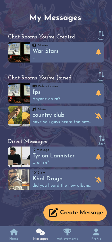
Revised structure:
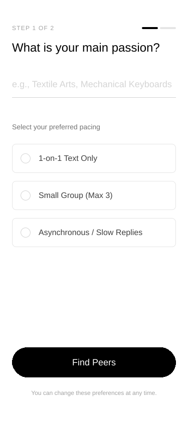
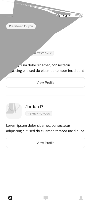
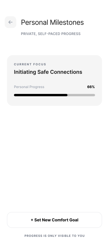
Upon testing this structure with real users, I realized the gamified loops and performative public spaces only fueled cognitive load and social anxiety. This prompted a radical pivot toward a more personal experience focused on safe pacing and intentional, low-pressure human connections.
Updated Low-Fidelity Concepts
WHAT WORKED
The shift to a more personal, low-pressure experience aligned design decisions with the emotional needs of the target users.
WHAT FAILED / LESSONS
It required discarding many early features and accepting that meaningful engagement had to be earned through comfort, not incentive mechanics.
Final Design Execution
Future Vision & Self-Reflection
Where the Product Goes From Here
Next steps
- Introduce gentle, opt-in prompts for pairs who have comfortably messaged for a specified duration
- Expand interest taxonomies to support micro-hobbies without cluttering top-level navigation
- Adapt the mobile low-sensory design system into a full desktop/web application to improve accessibility for homebound users
- Design low-pressure message starters and non-verbal reaction prompts to reduce friction when initiating or resuming chats after long breaks
Self-reflection
- Adding complex visual elements or colors too early obscured core layout flaws. Grounding the UI in low-fidelity wireframing first ensured functional clarity before establishing the dark, cozy aesthetic
- Redundant search bars and crowded navigation patterns overwhelmed users seeking low-stimulus environments. Designing for minimal cognitive load must be the foundational baseline, not an afterthought
- Challenging the initial assumptions around group chats and gamification led to a far more defensible, human-centered product that genuinely respects user boundaries